Create a Bauhaus Poster with the help of HTML and CSS
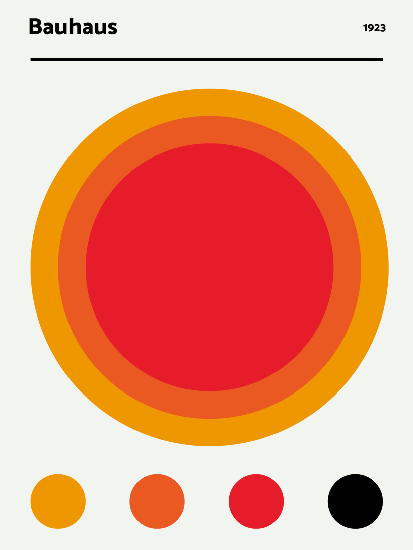
In this article, you will learn how to recreate a Bauhaus Poster from DESENIO in HTML and CSS, the rendering of the result PDF will be done on printcss.live. If you prefer watching me how I recreated this poster, have a look at my YouTube video covering the same.
#Bauhaus 1923

If you look at the result above you, see that this poster will be relatively easy to recreate with CSS. All you need is a header, three circles in the center, placed on top of each other, and four smaller circles below.
The first thing to look at is the HTML structure. All you will need are two wrapper divs containing the div elements for the single circles.
<div class="wrapper">
    <div class="c1"></div>
    <div class="c2"></div>
    <div class="c3"></div>
</div>

<div class="foot_wrapper">
    <div>
        <div class="c1"></div>
    </div>
    <div>
        <div class="c2"></div>
    </div>
    <div>
        <div class="c3"></div>
    </div>
    <div>
        <div class="c4"></div>
    </div>
</div>
The header will be directly set in the CSS code, so there is no need to create any HTML element.

Now in the CSS, let’s first concentrate on the header. As a font, I chose Catamaran, but you can take any other font too. Next, you should define the poster’s size, background color, and page margins. There will be a bigger margin on the top cause the header needs some space.
@import url(‘https://fonts.googleapis.com/css2?family=Catamaran:wght@800;900&display=swap');

@page {
    size: 30cm 40cm;
    background-color: rgb(243,244,239);
    margin: 4cm 2cm 2cm 2cm;
}
You can add the text for the header in the top left and right page margin boxes. This code belongs inside the @page rule.
@top-left {
    content: "Bauhaus";
    font-family: "Catamaran", sans-serif;
    font-size: 48pt;
    font-weight: bold;
}

@top-right {
    content: "1923";
    font-size: 24pt;
    font-family: "Catamaran", sans-serif;
    font-weight: bold;
}
If you render the code now, you will see that only the border below the header and the circles are missing.
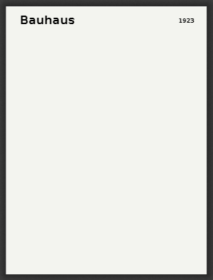
The border can be set directly on the body element as the page margin boxes surround the body.
body {
    border-top: 8px solid black;
}
Before you continue adding the circles, let us define their sizes. As the poster itself has a width of 30 cm and 2 cm of space on each side, the maximum for the outer circle will be 26 cm. This example’s inner circles are each 4 cm smaller than their parent, so 22 cm and 18 cm. For the footer, let us consider a circle size of 4 cm.
The wrapper for the big circles should also have 2 cm as the top margin, so the circles do not directly start at the body’s border. Additionally, the plan is to position the circles absolute, so you should make the wrapper relative.
.wrapper {
    margin-top: 2cm;
    position: relative;
}
As you can see in the HTML structure above, the big and small circles share the same class names. This is done because they should get the same colors. Only the last small circle has another color, the black from the header. This means defining the background color and border-radius within the c1, c2, c3, and c4 classes and the position we define specific to the surrounding wrapper.
The CSS for the colors is:
.c1 {
    background-color: rgb(239,152,1);
    border-radius: 100%;
}

.c2 {
    background-color: rgb(235,89,36);
    border-radius: 100%;
}

.c3 {
    background-color: rgb(230,29,42);
    border-radius: 100%;
}

.c4 {
    background-color: black;
    border-radius: 100%;
}
Now let us give all the small circles in the footer wrapper their size of 4 cm by 4 cm and render the PDF again.
.foot_wrapper .c1,
.foot_wrapper .c2,
.foot_wrapper .c3,
.foot_wrapper .c4 {
    width: 4cm;
    height: 4cm;
}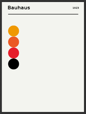
As you can see in the PDF screenshot, the circles are below each other and not in one line at the document’s bottom. We will take care of this after the positioning of the big circles.
The first or outer circle will get the 26 cm as size:
.wrapper .c1 {
    position: absolute;
    width: 26cm;
    height: 26cm;
}
Circles two and three will get their respective size and move from top and left accordingly to fit in the middle of the outer circle.
.wrapper .c2 {
    position: absolute;
    top: 2cm;
    left: 2cm;
    width: 22cm;
    height: 22cm;
}

.wrapper .c3 {
    position: absolute;
    top: 4cm;
    left: 4cm;
    width: 18cm;
    height: 18cm;
}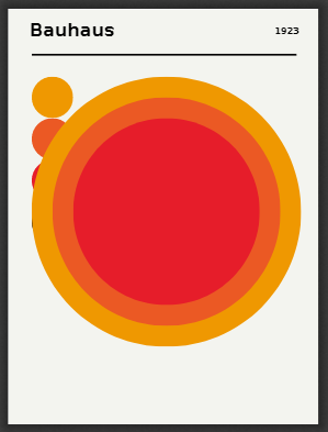
The only thing left now is positioning the small circles in a row below the big circle. You can use a flexbox for this and use justify-content to spread the elements equally.
.foot_wrapper {
    position: relative;
    top: 28cm;
    display: flex;
    justify-content: space-between;
 }
The result of the above code will give you the desired PDF. You can directly open this code on the PrintCSS playground or view it on Github.
