Create your Certificate PDFs with HTML and CSS
We all know the Certification PDFs you get at many e-learning platforms. Maybe you even need to create one for your own online course or platform; then this article is for you.
As in all other articles, we will use printcss.live to create the PDF so that there is no need to install any rendering tool on your machine. Also below example is optimized and tested with WeasyPrint; nevertheless, it also works fine with most other rendering tools on the website.
The goal is a certificate PDF that looks like this article’s main image, which you see below.

Let us start with the HTML structure and then move to the CSS part. For the structure, we will need an area for the pattern which surrounds the content area. As there will be another border inside the pattern area, we will need another div inside the content, which I called inner-content in this example. Inside this inner content element, we finally add the text itself, starting with the main heading Certificate. The sub-heading ‘of Excellence’ and additional information about the participant, course, and date follows the main title.
<div class="border-pattern">
    <div class="content">
        <div class="inner-content">
            <h1>Certificate</h1>
            <h2>of Excellence</h2>
            <h3>This Certificate Is Proudly Presented To</h3>
            <p>Jane Doe</p>
            <h3>Has Completed</h3>
            <p>PrintCSS Basics Course</p>
            <h3>On</h3>
            <p>Feburary 5, 2021</p>
            <div class="badge"></div>
        </div>
    </div>
</div>
Now let us have a look at the CSS code. First, we start with the page size A4 as landscape and the outer border.
@page {
    size: A4 landscape;
    margin: 10mm;
}

body {
    margin: 0;
    padding: 0;
    border: 1mm solid #991B1B;
    height: 188mm;
}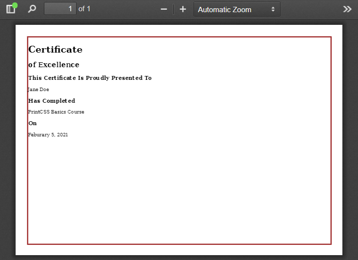
We set the body element’s height to 188mm because the A4 page in landscape mode has a height of 210mm, from which we need to subtract the 10mm margin (top + bottom = 20mm) and the border 1mm (again top and bottom = 2mm).
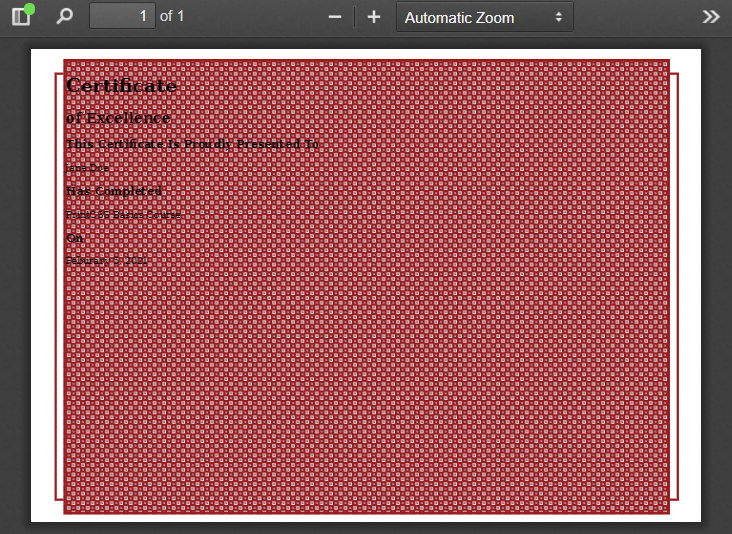
As the outside border is ready, we can have a look at the pattern now. For the pattern, we will use one of the fantastic SVG patterns from heropatterns.com. At the beginning of the article, the result picture shows us that the pattern is above the outside border on the page’s top and bottom. On the left and right, the outer border is visible.
We position the pattern div absolute, move it in from the left by 4mm, and move it outside the body by setting the top to -6mm. The height and width need to consider the wanted element size. The width is 297mm (A4 size) minus 20mm page margin minus 2mm border from the pattern element minus 8mm from the left and right. The height is 210mm (A4 size) minus 20mm margin minus 2mm border from the pattern element plus 12mm as it should be bigger than the body. Lastly, we set the background color and background image, which is copied from the hero patterns.
.border-pattern {
    position: absolute;
    left: 4mm;
    top: -6mm;
    height: 200mm;
    width: 267mm;
    border: 1mm solid #991B1B;
    /* http://www.heropatterns.com/ */
    background-color: #d6d6e4;
    background-image: url("data:image/svg+xml,%3Csvg width='16' height='16' viewBox='0 0 16 16' xmlns='http://www.w3.org/2000/svg'%3E%3Cpath d='M0 0h16v2h-6v6h6v8H8v-6H2v6H0V0zm4 4h2v2H4V4zm8 8h2v2h-2v-2zm-8 0h2v2H4v-2zm8-8h2v2h-2V4z' fill='%23991B1B' fill-opacity='1' fill-rule='evenodd'/%3E%3C/svg%3E");
}
The result should look like this, depending on the pattern you choose.
Now we will have to style the content element. Again this needs to be positioned absolute, and as the pattern is right now taking the whole space, this content element defines the size of the surrounding pattern.
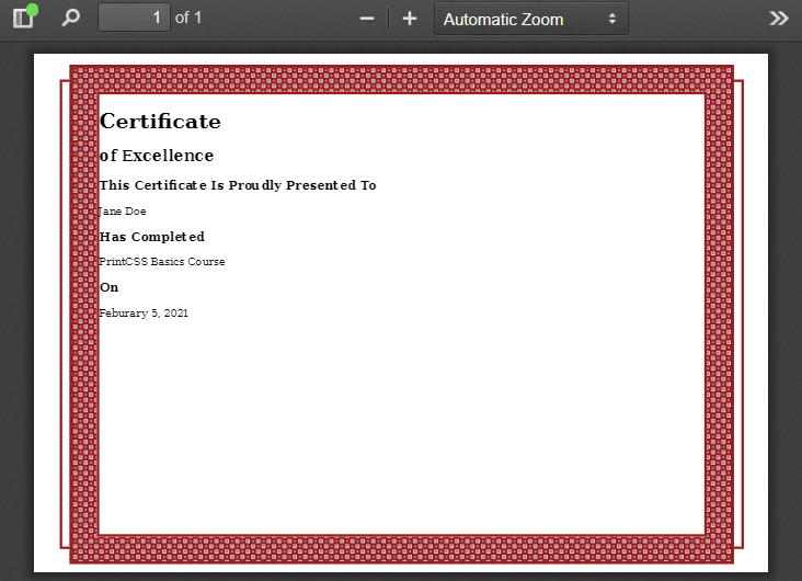
For this example, let’s give the pattern a size of 10mm and close the pattern area with a border of 1mm. Considering the width of the pattern element 267mm, the content’s width would be 267mm minus 20mm (left and right) minus 2mm (for the border). The content’s height would be 200mm minus 20mm (top and bottom) minus 2mm (for the border). As we want to put our content inside this div element, we also set the background color to white.
.content {
    position: absolute;
    left: 10mm;
    top: 10mm;
    height: 178mm;
    width: 245mm;
    border: 1mm solid #991B1B;
    background: white;
}
If we render this now, we already see the basic layout of our certificate.
But if you look at the result image again, there is another border before we can start with the actual content, and that’s why we have the inner content element. Here we set another 1mm border and a 4mm margin to have some white space between the border and the pattern area. For the content itself, we place a padding of 10mm, and as we want the element to take the entire space, we set the height. The height of 148mm is the 178mm (of the content element) - 20mm (padding-top and bottom) - 8mm (margin-top and bottom) - 2mm (border-top and bottom).
.inner-content {
    border: 1mm solid #991B1B;
    margin: 4mm;
    padding: 10mm;
    height: 148mm;
    text-align: center;
}
So now all the fancy content surrounding is done.
The main header is all uppercase, so we use text-transform to achieve this. Additionally, we change the font size and set the margin-bottom to zero, so the subtitle is closer to the header.
The subtitle gets a padding-bottom of 1mm to keep some space between the text and the border underline below. We use a pseudo-element for the subtitle to add a second underline, again via the border-bottom property.
The section titles in our example are done with the H3 element and have just some margin adjustments.
h1 {
    text-transform: uppercase;
    font-size: 48pt;
    margin-bottom: 0;
}

h2 {
    font-size: 24pt;
    margin-top: 0;
    padding-bottom: 1mm;
    display: inline-block;
    border-bottom: 1mm solid #991B1B;
}

h2::after {
    content: "";
    display: block;
    padding-bottom: 4mm;
    border-bottom: 1mm solid #991B1B;
}

h3 {
    font-size: 20pt;
    margin-bottom: 0;
    margin-top: 10mm;
}

p {
    font-size: 16pt;
}
So what is missing? The badge! Let’s take a badge icon from heroicons.com and use a URL-encoder for SVG to generate the background image code. The badge size should be 40mm by 40mm, and we position it in the right bottom corner.
.badge {
    width: 40mm;
    height: 40mm;
    position: absolute;
    right: 10mm;
    bottom: 10mm;
    background-image: url("data:image/svg+xml,%3Csvg xmlns='http://www.w3.org/2000/svg' fill='none' viewBox='0 0 24 24' stroke='currentColor'%3E%3Cpath stroke-linecap='round' stroke-linejoin='round' stroke-width='2' d='M9 12l2 2 4-4M7.835 4.697a3.42 3.42 0 001.946-.806 3.42 3.42 0 014.438 0 3.42 3.42 0 001.946.806 3.42 3.42 0 013.138 3.138 3.42 3.42 0 00.806 1.946 3.42 3.42 0 010 4.438 3.42 3.42 0 00-.806 1.946 3.42 3.42 0 01-3.138 3.138 3.42 3.42 0 00-1.946.806 3.42 3.42 0 01-4.438 0 3.42 3.42 0 00-1.946-.806 3.42 3.42 0 01-3.138-3.138 3.42 3.42 0 00-.806-1.946 3.42 3.42 0 010-4.438 3.42 3.42 0 00.806-1.946 3.42 3.42 0 013.138-3.138z' /%3E%3C/svg%3E");
}
We render the PDF one last time and have our final result! If you want to get the complete code, have a look in my GitHub repository or directly check it out on printcss.live!
